what is a 'genre'?
Genre is a term which can be applied to a variety of forms of media , ranging from music and film , to magazines and books. genres split up different media into different categories , based on characteristics which they share for example , narratives , settings , storylines , characters and themes . in particular genres can be referred to films , can be classified as being a particular genre e.g horror. genres are defined by conventions which can change over time , with new ones becoming invented as well as old ones being modified or upgraded
Genre is a term which can be applied to a variety of forms of media , ranging from music and film , to magazines and books. genres split up different media into different categories , based on characteristics which they share for example , narratives , settings , storylines , characters and themes . in particular genres can be referred to films , can be classified as being a particular genre e.g horror. genres are defined by conventions which can change over time , with new ones becoming invented as well as old ones being modified or upgraded
What is a 'magazine'?
A magazine , also called periodical is a printed or digitally published collection of texts , essays , articles , stories , poems and are often illustrated and is produced at regular intervals. the purpose of a magazine is to give its advertisers a chance to share with its about their products. also magazines are a great source if information and entertainment. Other than entertainment the purpose to dedicated uplifting its readers spiritually , mentally , emotionally and physically by providing practical, encouraging articles and messages on purpose-inspired people , health , family , education, business , finance , books, music and much more .
A magazine , also called periodical is a printed or digitally published collection of texts , essays , articles , stories , poems and are often illustrated and is produced at regular intervals. the purpose of a magazine is to give its advertisers a chance to share with its about their products. also magazines are a great source if information and entertainment. Other than entertainment the purpose to dedicated uplifting its readers spiritually , mentally , emotionally and physically by providing practical, encouraging articles and messages on purpose-inspired people , health , family , education, business , finance , books, music and much more .
What is the difference between PRINT and DIGITAL magazines
When is comes to reading articles and features , many readerships still prefer a tangible publication. while the internet is a great resource and one many people use to read up on the news and various click bait or niche stories , print magazines are viewed as more leisurely formats. and also many readers feel like sitting down and reading a magazine physically is more relaxing. however digital magazines are quick to produce , easy to access , and can offer more and many features (interactive) than a print magazine. also with a digital magazine you can carry it anywhere
When is comes to reading articles and features , many readerships still prefer a tangible publication. while the internet is a great resource and one many people use to read up on the news and various click bait or niche stories , print magazines are viewed as more leisurely formats. and also many readers feel like sitting down and reading a magazine physically is more relaxing. however digital magazines are quick to produce , easy to access , and can offer more and many features (interactive) than a print magazine. also with a digital magazine you can carry it anywhere
What are the different categories for magazines

here are some examples of different types of categories for magazines
- Children's magazines
- Fashion and style magazines
- Health magazines
- Sports magazines
- Politics magazines
- Celebrities magazines
- Entertainment magazines
- Music magazines
- Art/photography magazines
Magazine genres

|
Sport: Sport magazines are mainly targeted for audience that have a passion for sports. The first sports magazine started in France 2003 and the first London edition started on September 29th. Most sport publications welcome ideas , feature articles , reviews and news pieces from freelance writers. sports magazines , like most magazines , like to include reviews , of the latest gadgets , piece of clothing , sports venues or clubs. they need to include information on who is doing it / wearing it / attending , what the benefits, of the product or location are , a nod to any drawbacks , and importantly practical information , such as cost , location and availability. The way publishers advertise their magazines is that they use popular and the biggest names in the sports and usually they are on the front page of the magazine and the content around it. sports magazines usually appeal to sports enthusiasts and people the age of 16 to 40 or older. and this is also targeted to all genders as-well (gain market share) Music : the first music magazine to be published was the new musical express and has been published since 1952, it was the first British paper to include a single charts , in the edition of 14 November 1952. music magazines is for readers to be updated on a specific genre of music. upcoming gigs, interviews with musicians and everything music based. so it is informing them on all things that genre. these magazines aren't free so the have to persuade the audience to buy their magazine with persuasive language , deals and colour. on the front page o magazines publishers make the name bold , short and memorable. sometimes publishers and 'exclusives' , the aim of this is to attract the audience and and sell it to them as it is a world exclusive . also good looking young people are on the front of the magazine attracts readers of attracts a specific target audience. publishers would and what is popular right now , songs that are top of the charts or artist upcoming artists in the industry that are on the charts. furthermore bonus features for other stories which could appeal to the reader.
|

Fashion: most fashion magazines include beauty advice, "real-life" advice , the extravagant parties of high society , and maybe a profile of someone truly inspirational( e.g a fashion designer , or designer of something). most magazines have all the aforementioned content before the fashion spreads. Despite the number of fashion magazines currently available, it is probable that most people appreciate fashion through the daily press, the popular lifestyle and celebrity magazines, television, and the Web
TV/ Entertainment

In this type of magazine, The Entertainment magazines focus on the "musts" in the entertainment industry with the latest Tv shows, music, and a narrative that goes along with previews of upcoming projects in the media which gain interest with different types of audiences. With the TV magazines, these magazines are usually published weekly and consists of different articles about current events. e.g. the news magazines discuss stories in depth.

Political journalism aims to provide voters with the information to formulate their own opinion and participate in community, local or national matters that will affect them. Also the influence of the media is increased by the fact that campaigns today have become more focused on the individual than on the party. In order to win primaries, individual candidates seek media attention to gain attention from voters. The majority of political magazines are aimed towards audiences that are interested with politics.
Market Analysis

Demographics information is used in the media for media marketing and this classifies an audience into age, gender, race and other categories. Demographics are also broken into bands depending on people's jobs or statues
Physchographics separates or divides the market into groups based on social class, lifestyle and personality characteristics. It is also based on assumptions that the types of products and brands an individual purchases will reflect that person's characteristics and patterns of living
Geographics divides a common strategy when you serve customers in a particular area, or when your broad target audience has different preferences based on where they are located. It involves grouping potential customers by country, state, region, city or even neighborhood.
Convention Magazines
|
|
Textual Analysis

Denotation
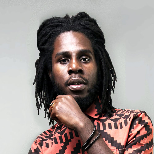
In this magazine image we can see the main image who is Kendrick Lamar in the middle and covers the whole page, here the publisher uses the camera angle of a close up and This engages the audience more and this helps the audience identify who the main artist is and also his hand on his chin could indicate how strong and arrogant he is. In this magazine the majority of the text is written in green.
Mise-en-scene
The colour green connotes wealth in terms of the crown and the ring which dazzling on the page this could also catch the audiences eye easily also ambition, relaxed and youthful as he is shown quite young on the magazine front cover. The crown on his head could also indicate that he is the king / ruler of what is does in the music industry and could mean that he’s seen better than other artist in the same music genre as him. Furthermore, there is elements of black in the text, the colour black connotes power, strength and authority and all of these verbs are illustrated through his facial expression on the cover.
Typography
The typography used is the serif font which is basic and easy. At the top of the magazine the masthead is bold and has a bright green tone, this makes it appealing to the audience as the colors stand out and the green, white and black go well together on the magazine cover.
Target audience
The target audience is both male and female but could predominantly be male and a lot more males could relate to his music more than a female can and males are more involved in hip hop. this magazine is targeted around the ages of 18-25 as the artists pictured in the magazine looks youthful and relaxed

Denotation
In this magazine I can see a middle aged black artist on the left hand side of the magazine wearing a black and white suit , he has a champagne bottle and a glass in his hands, the background is white and has white balloons in the background. The publisher has used used a full shot camera angle to illustrate or to frame a person from head to toe or completely frame an object. A full shot is used either to establish or follow a character. The masthead and the rest of the text of the magazine is in black. Mise-en-scene And for the character he’s wearing a suit which is also black. The connotations of the colour black portray power, authority, strength and formality. And we can see this through the artist’s posture as he is stands sophisticated and classy. The artist is wearing a suit and this illustrates to the audience that he’s inventive and keen, this can relate to his personality and states and this taking it back to his music. The background of the magazine has balloons and confetti and this could suggest that something positive has happened or a celebration has occurred. This can reflect on his music. In the picture he has used props such a glass cup and a Champagne bottle, by using this increases the idea of the celebration theme of the magazine. Typography The font that has been used for this double page magazine is a sans serif font which means the font has detailed lines coming out of the letter. the masthead of the magazine is bold and is made in a reflection of the text above creating attention for target audience. Target audience The target audience for this magazine is 25-30 year olds as the magazine looks very sophisticated and wealthy and this magazine looks like it has mainly be aimed for men 
|

Denotation
In this magazine image we can see that a young artist who looks youthful an happy, he is also wearing a big long chain, a purple snap back cap matching his shirts as well. he's also wearing expensive watched and a bracelet. The publisher has used the camera angle of a mid shot which is when the camera focuses on the medium size section of something in this case the artist from their head to their waist. And this is presented as the artist taken up the majority of the page and to the audience this makes it eye catching and makes them recognize that he is the main focus of the magazine. Mise-en-scene In the magazine the artist is wearing a lot of purple, the color purple connotes wealth and luxury as he is wearing a gold long chain, a gold watch and bracelet this could suggest that he as a young person he makes a lot of money through his music meaning he can buy a lot of expensive items. Purple also connotes creativity and ambition, we can see this creativity through his style of clothing and the different designs on his shirt. In the magazine majority of the text is written in white, the color white connotes purity and positivity, we can see this positivity through him smiling in the picture and also through his posture we can see that he looks like he laughing and he looks like a fun person, this could suggest his personality and he character is vibrant, lively person and this could reflect in his music. Additionally, this contrast with the hip hop genre Typography The font that has been used in this magazine is a serif font which means its basic and simple. in the corner of the magazine is the cover line and this is presented as bold and big creating attention for the audience Target audience The target audience for this hip hop magazine is for young teens from the ages of 16-18 including both female and male but mostly male. denotation
in this double page article, the picture of the artist Jay Z is wearing a necklace and sunglasses and a black t shirt. on the left hand side of tth magazine is the model with the background of red and light blue and on the right hand side is the article. in the middle of the double page article there is the letter "J" in a large text font. this double page has a few cover lines mise-en-scene the rapper featured in this magazine is Jay Z and by his facial expressions he has a dull and straight face on. this could convey to the audience that he is a serious and resistant person, his facial expressions can also illustrate that he could be angry. the sunglasses and the necklace/chain that he is wearing could convey that he is an wealthy artist and this is very common for a lot of hip hop artist to wear these types of jewellery. typography the font that has been used in this magazine is serif meaning that it is a simple and basic. in the middle of the page there is the letter "J" this engages the reader and from the picture and the letter the audience are aware that the magazine is about Jay Z. at the top of the magazine it says " the most exciting people in music" this is also another way of engaging the reader and drawing their attention into the magazine and this is good for audience that are fans of this particular artists and genre target audience the target audience for this magazine is male and female but predominantly men as they are more interested i rap and hip hop. the age ranges from 14-30 year olds. |
Platform Consideration
digital vs print
digital vs print

Digital magazine publications are renowned for their interactivity and their display of media. When creating or building an online magazine, you are likely to use features that enrich the user’s experience such as video, Audio, web links and social plugins. Such features mixed with the attractive designing options, multiple layouts and easy to use software make this digital publishing format extremely popular. The advantages of digital magazines are that apps / digital downloads are easy for the audience to view and read the magazines. Digital magazines include subscriptions whereby you don’t have to pay for per release. Also as digital magazines are at low cost and cheaper to distribute compared to printed magazines you don’t have to worry about being a lot of money as digital magazines are free and cost of print magazines include transport costs. However, the disadvantages of digital magazines are that it could sometimes be harder to read and therefore the audience/ reader have to keep on zooming in and out to see the text. Also people may have outdated software which means that they wouldn’t be able to get the latest magazines. And people may have troubles of having poor connection which enables them to access updated magazines, as for a print magazine you wouldn’t have to worry about any of these issues because it does not run on power.
Print media is a popular way publishers and marketers and promote and advertise information through magazines, newspapers and flyers. and this method is in fact the easiest way to reach the target audience. the advantages of print is that monthly magazines are a great way to bring attention to specific adverts and campaigns and also the target audience. it is also easy to spread awareness and to advertise in a particular place, such as local magazines and newspapers and this is a convenient way to spread the local news , information and events in the local communities. print magazines also allow to have your own freedom in creating and advertising how you want the outcome of the magazine to look like, this means you don't have to worry about having to spend a lot of money on advertising. however there are disadvantages of print magazines such as when a particular magazine may not be available for the target audience, meaning that they have to wait for a long time to receive that magazine whereas a digital magazine you can access the available magazine anytime and anywhere. the cost of printing the magazine can be expensive due to the amount of the colour artwork.
Print media is a popular way publishers and marketers and promote and advertise information through magazines, newspapers and flyers. and this method is in fact the easiest way to reach the target audience. the advantages of print is that monthly magazines are a great way to bring attention to specific adverts and campaigns and also the target audience. it is also easy to spread awareness and to advertise in a particular place, such as local magazines and newspapers and this is a convenient way to spread the local news , information and events in the local communities. print magazines also allow to have your own freedom in creating and advertising how you want the outcome of the magazine to look like, this means you don't have to worry about having to spend a lot of money on advertising. however there are disadvantages of print magazines such as when a particular magazine may not be available for the target audience, meaning that they have to wait for a long time to receive that magazine whereas a digital magazine you can access the available magazine anytime and anywhere. the cost of printing the magazine can be expensive due to the amount of the colour artwork.
Distribution of Print and Digital magazines

Print magazines can be distributed globally meaning that any issue of magazine can be bought by everyone worldwide. this also means that all of the sold copies of magazines will increase ,bringing more income to the magazine company. Furthermore by the increased amount of copies sold and an increase in income to the company, this creates an image for the company where by globally it will be known as a well-known, successful brand. many of the users for print magazines will buy the magazines from places such as supermarkets, music shops, clothing shops or local corner shops. their are magazine publishers. Also each publisher uses a network of distributors. and they manage the flow of magazines from the printer to the final newsstand , and this is where magazines are sold. magazines are taken in lorries to regional distributors and they move these to the shops and newsstands. the main shops are where magazines are sold such supermarkets and local corner shops and newsagents. the publishers of magazines usually distribute the magazines they are publishing. However the distributions of digital magazines is online. you have to visit the publishers website to purchase and download the magazine. the great thing about this is that this saves you time because you don't need to travel to the supermarket or the local shops to buy a print magazine , however the disadvantage of this is that by downloading many magazines this can take up a lot of storage on your device and it requires an internet connection or may be difficult to use with slow connection. this also means you can't purchase the magazine with cash and requires a bank account or online banking.
Target Audience

The limitations of print magazines to address target audience is that some audiences may feel like magazines may target one particular target whereas online they cover and reach out all. the advantages of print magazines for the target audience is that people are visually and physically allowed to see the magazine before coming to a conclusion on which type of magazine they would want to buy. and the thing with print magazines are cheap cost around £5 - 10. socially with print magazines you will be able to share the magazines with your friends and families making the reviews of the magazines pleasant enough so that more people can but the magazine and this creates a wider audience. with digital magazines an advantage is that you have an easy web link access on your device , which is presented well and tidy for the target audience to look at. also with a digital magazine it doesn't take a long time for the magazine to reach the audience as it is a quick process for the audience to receive the magazine on the same day. having subscriptions on a magazine means that the target audience is is open to range of links to more and other magazines so you have a better options on viewing different magazines. however the disadvantage of print magazines is that print magazines can rip/ tear and you wouldn't really be able to read the magazine and also the particular magazine that you may want to buy may be sold out and delivery may take long from around 2-5 days to receive the magazine. another disadvantage is that a lot print magazines are being produced by paper which is mainly the product that is used to create the print magazine , some target audience believe that this could possibly be environmentally damaging as we are using a lot of trees to produce magazines. the disadvantage of digital magazines is that the target audience may not have a lot of storage which may mean that they wouldn’t be able to download the magazine onto the device. devices have run on battery life which means that once the device has died out in between where you were reading , you would lose track from where you was
Technical Requirements
the technical requirements for print magazines is that the size of the paper whether it should be A4 or A5 and how the text should be presented or formatted and what color or fonts it should be. also the contents page on magazines should highlight key pages and the correct page numbers and should be numbered to correct to the correct page. the content should be presented nicely and the headings should be kept on the same page as the text that follows them. bleed lines should be used to ensure that you don't cover the whole canvas of the magazine because some words may be cut out or the image could be missing when printed
the technical requirements for digital magazines is that some apps don't fully encourage or support all digital magazines. also some colors and fonts may not appear clearly onto the digital magazine which means this could impact on the message or meaning which is already embedded into the text by the reader. the options for the distribution of digital magazines are more limited for digital magazines.
the technical requirements for digital magazines is that some apps don't fully encourage or support all digital magazines. also some colors and fonts may not appear clearly onto the digital magazine which means this could impact on the message or meaning which is already embedded into the text by the reader. the options for the distribution of digital magazines are more limited for digital magazines.
Reggae Genre Profiling

Reggae is the most famous of a whole interconnected family of Jamaican musical genres. The most important of these genres are ska, rock steady, reggae, dub, and dance hall. There are numerous sub genres and specific eras within these genres, but they should be understood as a family of musical styles that make up the amazing tapestry of Jamaican popular music
The style of reggae originated from Jamaica in the late 1960s and quickly emerged as the country’s dominant music. By the 1970s it had become an international style that was particularly popular in Britain, the United States, and Africa. Reggae evolved from these roots and bore the weight of increasingly politicized lyrics that addressed social and economic injustice.
The style of reggae originated from Jamaica in the late 1960s and quickly emerged as the country’s dominant music. By the 1970s it had become an international style that was particularly popular in Britain, the United States, and Africa. Reggae evolved from these roots and bore the weight of increasingly politicized lyrics that addressed social and economic injustice.
Greatest Reggae Albums
|
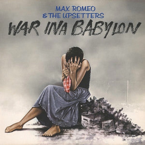
War Ina Babylon
release date: 1976 artists: max romeo , the upsetters |
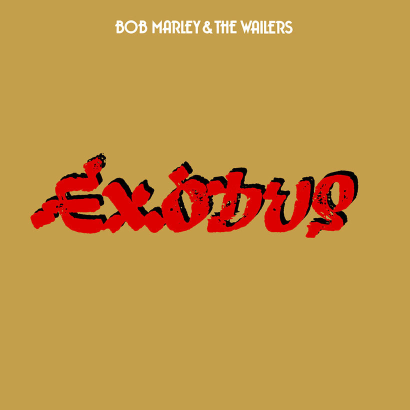
Bob Marley and the wailers’ exodus
Release date: 3rd June 1977 Artist: bob Marley |
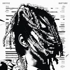
Rapture
Release date : 14th March 2019 Artist: koffee |
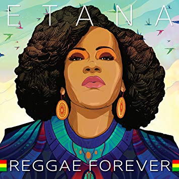
Reggae forever
Release date: 8th march 2018 Artist: Etana |
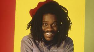
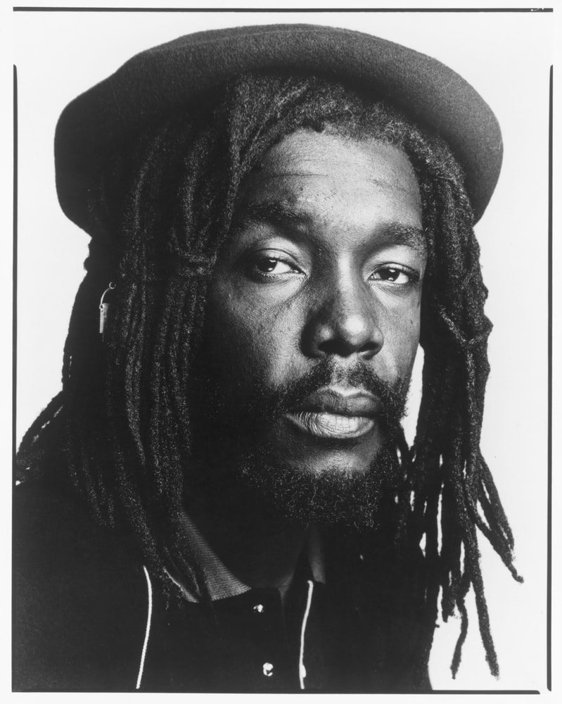
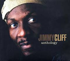
Greatest Artists

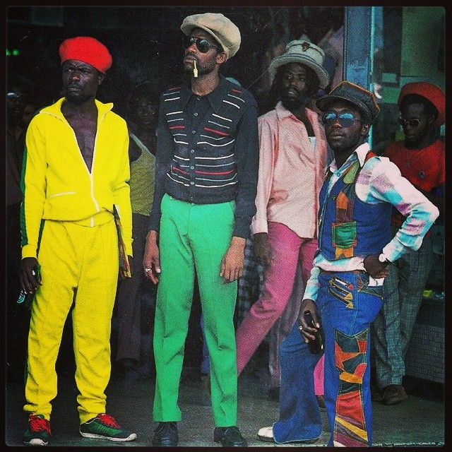
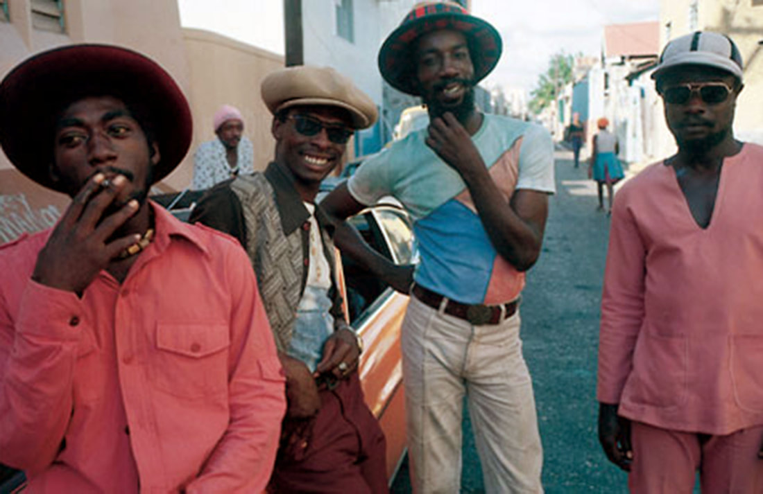
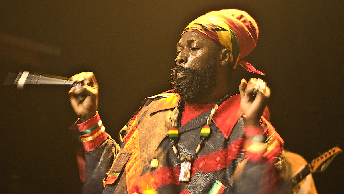
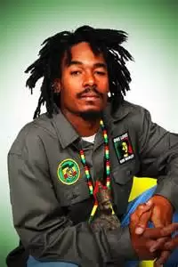
Fashion styling: the term reggae was derived from rege- rege, a Jamaican meaning “ rags or ragged clothing,” it is used to denote a ragged style of music. the reggae genre came into being in the 1960s as an evolution of the rock steady and ska musical style. reggae music is soulful. entertainment in Jamaica. it expresses in words the pain, struggle, hope and emotion that is felt by the average person.
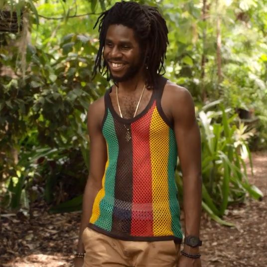
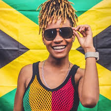
The reggae clothing is oriented towards the African culture and portrays the Ethiopian symbols and colors. pan African colors like green, yellow and red are very common in these types of clothing. it is also known as Rastafarian style and this has relations to African connections.
dressing in reggae trends requires projecting cool, relaxed and natural look. it's simple, comfortable and vibrant colors that relate back to the reggae trend. clothes such as tees, tanks, sweats, pants and any other casual garment along with accessories like bags, bands,watches and loads more which can complete the look.
Typography boards

|
|

|

|
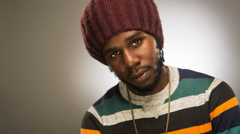
Poses
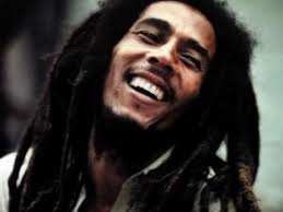
Smiling and Laughing

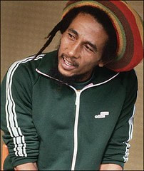
Smoking
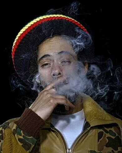
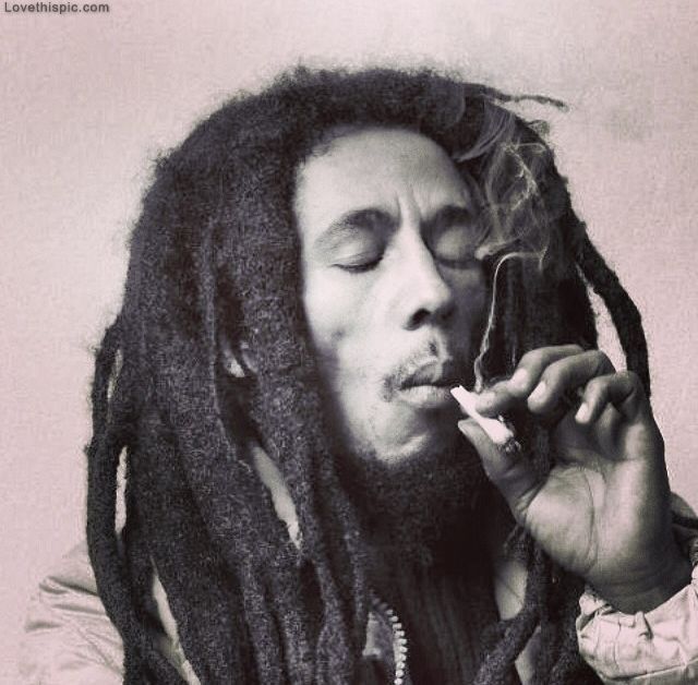
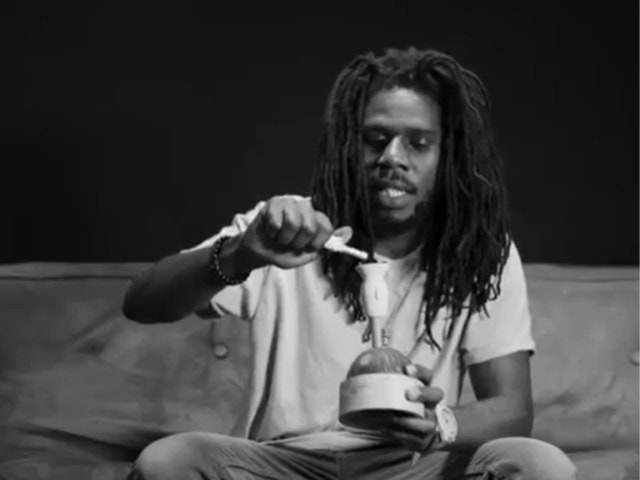
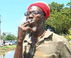
Smoking marijuana is considered a religious ritual and this is to open their mind and increase their spiritual awareness.
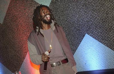
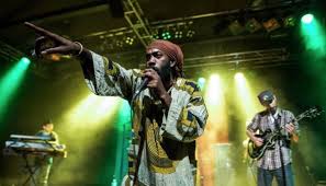
Performing
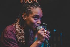
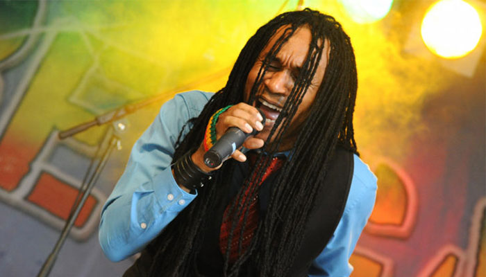
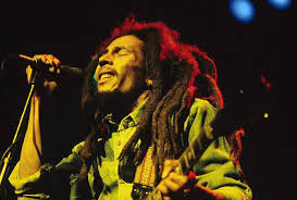
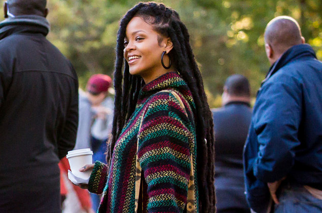
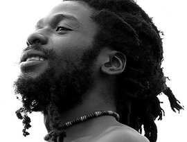
Dreadlocks
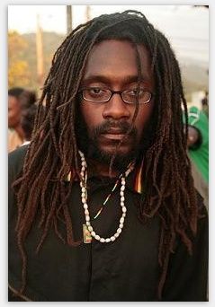
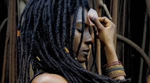

Dreadlocks are a symbolic of the Lion of Judah which is sometimes in the middle on the Ethiopian flag. In the Rastafarian culture they are inspired by the Nazarites of the Bible
Necklaces
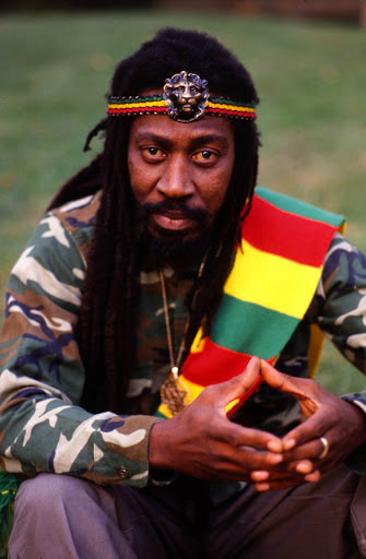
Hats
Wearing hats is most commonly associated with the pat as a way for Rastas and others with dreadlocks to tuck their locks away, but this may be worn for various reasons.
Audience profiles


Name: Shanise Thompson
Age:18
Education: student
Height: 5"6
likes: sports , singing and travelling
dislikes: horror films, winter and pop music
Age:18
Education: student
Height: 5"6
likes: sports , singing and travelling
dislikes: horror films, winter and pop music

hobbies & interests
Currently in sixth form studying business, PE and media. She likes to play sports such basketball and football. on the weekends she plays for girls football team. also in her spare time she listens to reggae music and likes to sing
clothing and fashion
Shanise likes to wear bright colours such as yellow, red and green and these colours link back to her favourite genre of music which is reggae. however she does have a vintage sense of style of wearing baggy jeans and graphic t shirts. trainers are her favourite footwear as well. Her favourite shoe brands are Jordans and Nike and her favourite clothing brand is Chanel and Prada
Shanise likes to wear bright colours such as yellow, red and green and these colours link back to her favourite genre of music which is reggae. however she does have a vintage sense of style of wearing baggy jeans and graphic t shirts. trainers are her favourite footwear as well. Her favourite shoe brands are Jordans and Nike and her favourite clothing brand is Chanel and Prada
Digital drafts


|


|
front page magazines

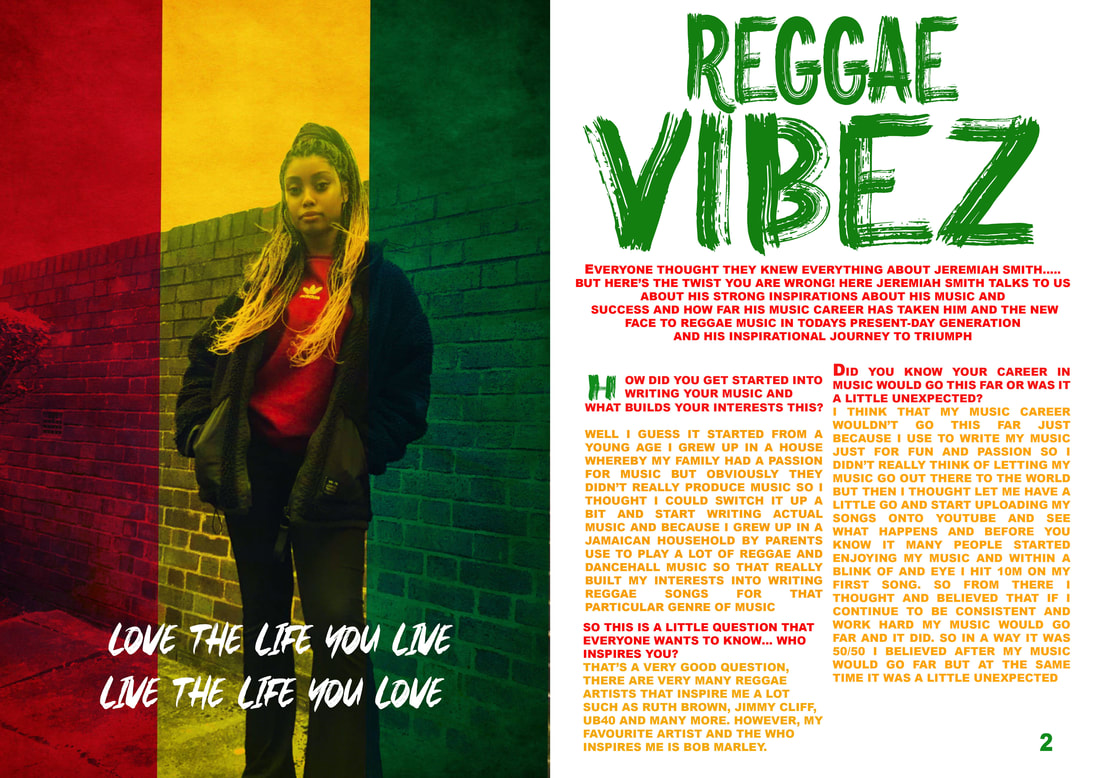
In creating my magazine ive chosen the colour scheme of green. yellow and black to match with what my client is wearing and this represents the reggae theme/ genre. The masthead is bold and big, usually in reggae magazines the fonts are usually like this. i've added in some famous reggae artists on the side as well. however i still need to add quite of lot of things to my magazine such as my main cover lines, barcodes, social media platforms etc.

This week the changes i've made to my front page cover is that i've added margins/ guide lines to help to get the right positioning for my magazine and this also helps to make sure my texts don't go towards the end of the page. I've changed my masthead because the previous font that i had wasn't giving off a reggae vibe or didn't really seem to be a reggae theme based magazine so i went on the internet to look up different types of reggae magazines and their fonts. After i look up a website whereby i can download different fonts relating to my genre. After i found the right font i installed the font and i went on photoshop and used the font. I also used the stroke to to create an outline of my masthead and the date line to make it standout more.

Here I've adjusted the pull quote a bit higher because i thought that the pull quote was too close to the margin and I thought if this was going to be printed out I thought that it would be too low on the page. I've made the subject's name a bit bigger than before and made the text on the same line because previously it was way too small and the reader would be able to read it because it's way to small. However I am considering changing the fonts of my pull quote, the main coverline and the other quote because I feel like it doesn't give off that reggae

so far the changes i've made in my magazine is the main coverline. what i done was that i made the fonts for the names of the artists bigger and put their songs underneath their name and i also made it small instead of making it all the same size, this makes the artists name stand out more. i added "featuring" above the names of the different artist to make it obvious to the target audience that these are the particular artists that are going to be seen/ featured.
Double page magazines

This is a snapchat of how i started my double page magazine. I added my picture and I've created templates of where i'm going to be added my texts to. I've been struggling to get a good size of my picture and getting it to the right position on the left hand side of the page. currently i'm still trying to get the picture in the perfect shape without stretching the page and not making it inportionate. I've chosen this picture because i thought that this picture would match my reggae genre. the style of hair, i thought is was convenient as well because it looks a lot like dreadlocks and is kind of close to what it looks like, a lot of reggae artists have look/hairstyle and it very ionic.
|
( Today I've added text into my templates to know where im going to be adding my information onto my magazine. i've also added the name of my magazine on to the magazine and i've changed the font of text to match the theme of the reggae genre. I enlarged out my picture a bit further on my page however it is a bit stretched out and pixelated so I'm going to have to decrease the size of my picture. ( do something differently)
|

|

In today's lesson i've taken away some of the columns because i thought it would take up a lot of space on my page and also i wanted to think about how i'm going to actually put my text on the page. so what i done is that because there's some elements of green in the picture i thought i would make the columns the same colour to complement it. i reduce the number of columns to two the double page article because i thought that having three columns would make my text really small and wouldn't be that clear to read so i thought if i have two columns i would be able to fit some of article on there, However i think i may need to add another separate column because i still need to add more of my article on there and can't squeeze my text on the page as it wouldn't look presentable. I've changed the text to match the theme of my genre

Today i've made a few changes with my magazine double page. I've hidden the columns to see where i can position my article and i've changed the size of the of the font to fit into the hidden columns. i've changed the size of my masthead because i thought is was to small and i needed to fill up space to i made the "vibez" part bigger than "reggae" to make the masthead stand out more and be a bit different. the margins have been put in place so that my text can stay in line and in position on the page and so that text doesn't overlap or go to far out. i realized that the picture i'd taken was very bad and pixelated whenever i enlarged it so i thought i might have to change the picture. I've put in "page numbers" in the corner to help me know where I'm going to put my page numbers .

In today's lesson i've made slight changes from the previous lesson for example I changed the picture to a better and clearer picture because the previous one was to blurry and it wasn't a good quality picture so i'm glad that i took many pictures of my model because if i had a particular problem with the picture I can also go back and change it and look for a better picture. I went on the internet and i looked up reggae textures because i thought that my magazine will look a bit boring and dull so i thought i needed to add something to make it look more appealing and vibrant. I added a pull quote to my magazine that is related to the "reggae vibez" theme. The reason why i chose that quote is because since reggae is about happiness, having good vibes and love i thought it would be good to add in a pull quote so that it can match with my magazine

Here in this lesson i've tried to experiment with my magazine to see what i can add to make my magazine stand out a bit more because i thought that of i had white background it wouldn't stand out. So i decided to but the reggae texture over my article to see if it will stand out or look a bit more colorful. Once i but the texture over the article i started to use different such as darken, lighten, to see the different textures and how it will look over the text. when i was selecting the different textures i was also adjusting the fade to see if it looked better faded out or in its normal full colour.

Here I've changed the background texture that was over my article back to white because i thought that it was too much to look at and the colours were a bit to powerful over the text to i thought i'd change it back to white because i thought it will look better that way. i've also changed the colour of my text back to the original colour so that it will be easier to read for the audience and i think that the yellow and red text is better and visible in front of the white background. I've changed the colour of the number "2" in the corner because originally it was black but because i wanted my text to correspond and match with my colour scheme i changed the colour of the "2" to green. I think that i've chosen the correct colours for my magazine as it relates to the reggae/rastafarian theme

At the end i added in a drop text to my magazine and I changed the font and the size of the first letter. The reason why i added this feature is to make my magazine look realistic. I also think that creating my double page magazine was much more easier than my front page because with my front page there was a lot for to add and getting the positioning and sizing right was a bit difficult for me. whereas the double page was less work however i did struggle with finding the right picture and sizing to how i want it to look on my page, therefore that is the reason as to why i had to changed my picture so that is is much better quality and so that it is clearer. overall i am happy with both my front page and double page article and both their outcomes despite the difficulties i had during making both magazines. I also think that my target audience will be to identify easily that my magazine genre is reggae due to the typography, mise-en-scene, codes and conventions and the colors that have been used
Final upload
Front page magazine |
Double page article |

|
|
Final Evaluation
FINAL EVALUATION
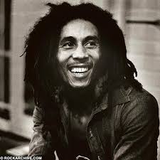
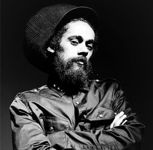
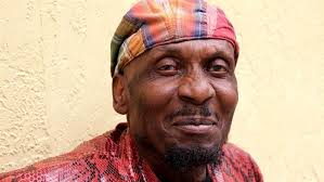
Here are my two magazine covers, the double page article and my front cover. I created these magazines using the codes and conventions of the layout and the design to address and appeal to my target audience my target audience is both middle aged and young black male and females. I’ve chosen this particular target audience because I feel that a lot of young black people enjoy the reggae genre as in gives of a sense of rapture and for middle aged people from around 28-35-year-old I selected this particular age range because reggae isn’t all about happiness and joy but is also about reflection and how black people from the Jamaican origin have grown up in poverty so I thought this target audience could relate to that upbringing more. The way I’ve used this to appeal to my target audience is mise-en-scene. Mise-en-scene includes costumes, non verbal communication, lighting, props and setting. The costumes I thought I’d go for is a is urban/ casual style with a reggae style of clothing as well since my target audience is at the age range of 18-25 and for my other target audience which is ranged from 28-35-year-old I’d gone for a more of a vintage look which is reflect a lot more in the reggae style and culture. This is reflected through the colours such as red, yellow and green to signify the Rastafarian culture and movement. Usually reggae artists smile a lot in photos of their magazine front covers and this conveys their happiness, their good vibes and passion and some artists have a straight face conveying their seriousness and this could reflect in their music. I didn’t really use a lot of major props in my magazines, now looking back I feel as if I should have added more props such as a guitar or a microphone or a Rastafarian hat to help increase the idea of the reggae theme and these particular props are very common with a lot of reggae artists such as Bob Marley, Jimmy cliff and Dennis Brown and these are some of the artists I was looking up to give me an idea of how I’m going to create my magazine and maybe how I want my model to pose. Instead of me using those particular props I used small props such as necklaces, rings, bracelets and earrings for my model for the front page magazine and for my double page I didn’t use any props, maybe if I used props for my double this would have given much more a reggae outlet. For my front page magazine I used the green room in college to take my front cover magazine pictures i also used a white back drop i chose this colour to make my picture seem more clearer and i wanted my artist to be my main focus. I made my artist pose with her hands out towards the camera, thought she should pose like this is give off that young looking appearance and so this relates back to the target audience. For my offsite pictures I took my pictures in different places such as different places in the park including the cemetery, a bench and in front of a brick wall opposite a house. The reason i chose these places is to give an impact of an vintage look to my picture and also when i researched pictures of different reggae artists and their fashion a lot of them models were pictures in front a wall or near pubs or taken group photos, these types of photos i researched were from the 60s. The use of my typography was that it would be big bold and to resemble the Jamaican/ reggae colours. The reason behind this was to help the audience identify the magazine genre. So I researched different magazine covers and their different typographies to give me an idea of how I want my fonts to look like such as the masthead, main cover line, cover line and pull quotes. Once I researched the different magazines I went onto Photoshop to start creating my magazine. At first what I found difficult was choosing the correct font because some of the fonts didn’t relate to the reggae genre so I downloaded an app so that it gave different types of fonts that are related to the genre and that helped out a lot. Photoshop i also created different typography boards of different fonts for headlines, cover lines, pull quotes and cover lines. I also struggled with the sizing of my fonts such as the mastheads because i thought they were too small to i enlarged them so that its more recognisable that it is the masthead, i struggled with also getting the correct size font for the double page article, i had to make sure that the font wasn’t too big or too small. Within my both of my magazines i tried using different colours to see if it would make my magazine a bit more vibrant; however i stuck to the original colours of the reggae theme. My target audience will be pleased that i changed the colours and changed the position and the sizes of my text. in front page magazine i included the main cover lines, cover lines, masthead, barcode , price , pull quote, dateline, social media logos, website address and the selling line and in my double page article i included the headlines, written article, text columns, page numbers, pull quote and a drop text. Without these conventions my magazine wouldn’t look realistic magazine, this could also mean that if it doesn’t look realistic enough then this may cause disorientation within the target audience and may not be clear to them if it is a magazine or not . However I feel that I did a better job in creating a realistic front page magazine because I included everything rather than my double page because with my double page article I missed a few key things such as the subjects name and the by line.
My magazine genre is Reggae and in my genre profiling I spoke about how reggae music is soulful piece of entertainment in Jamaica and it expresses in words the pain, struggle, hope and emotion that is felt by people. What I have in common with my magazine is my masthead because I believe that this resembles the reggae genre because it is big, bold and has an exciting font which builds the idea of the music genre. This will help the target audience to identify that specific genre. As a result of my front cover page and glad the way it turned out. For my double page article I’m glad the way my magazine turned out because it mirrors to the reggae genre and this is because of the main picture and its reggae texture overlay that makes it dynamic due to this my target audience will like the look of this and will like how the text is simple yet colourful to match the reggae genre and the masthead also draws the attention of my target audience as it is big and bold. In general I am happy with how my conventions turned out for my double page article.
In conclusion I think that my magazine resembles the reggae genre. Through the uses of codes and conventions, typography and my mise-en-scene and genre specific. I’ve used all of these aspects in both magazines to reveal to my target audience what the specific genre is. Ways in which this appeals to the target audience is the dynamic red, yellow and red colours that I’ve used to keep the reggae theme consistent in my magazine. Also for my front page this appeals for towards the younger generation from the ages of 18-25 this is visually represented through the way in which my model is posing and giving off a youthful personality whereas in my double page article this target audience is aimed for the ages of 28-35 as this is more vintage and a relaxed picture. The use of typography helped me to figure out how I would want my text to turn out and how i want my fonts to mirror an actual reggae magazine, so how I done this was to include the Rastafarian colours and change the font into a font that suites the genre and to make the text big and bold, this appeals to my target audience because they be able to easily identify the genre and style of music. The costumes used in my front cover where to represent the younger generation and Jamaica and the the double page to represent the older generation with the vintage look, because the vintage look and the representation on Jamaica is shown this automatically shows to my target audience the genre.
